Introduction to Voilà, Part 1: Overfitting a Regression Tree, Interactively!
6th May 2022Introduction
Recently, I have learned about Voilà, which turns Jupyter notebooks into standalone web applications with interactive widgets. To me, this sounded like the perfect tool for giving data-based presentations to non tech-y folks who do not care or might get confused by source code. Hence, I instantly jumped at the first opportunity to learn how to use it.
In this post, I'll describe how to set up and use Voilà. To this end, I have written a small example application that demonstrates the fitting of a regression tree to some randomly generated data. The projects also nicely illustrates the problem of overfitting a model to training data and the subsequent loss of accuracy in predicting withheld or new data. All of the source code can be found in this jupyter notebook.
As far as I know, it's also rather easy to serve a Voilà dashboard to the web, for instance via heroku, which I have already successfully used in the past for my Covid dashboard. As soon as I have figured out the exact details, I'll write them up in another post for future referece.
Setup
Installing Voilà is extremely simple. Just run pip install voila. If you additionally want to use Voilà gridstack, which allows you to determine the layout of your web application using a simple drag and drop tool within Jupyter Lab, then also run pip install voila-gridstack. I'd also recommend installing Jupyter Lab in general, which can be done via pip install jupyterlab -- in my opinion, it makes interacting with Voilà easier than the traditional Jupyter Notebook.
Interactive Widgets
The real power of a standalone web "dashboard"-like app lies in interactive elements which adjust the presented analysis in real time. To use such widgets, add the following two imports to your project:
import ipywidgets as widgets
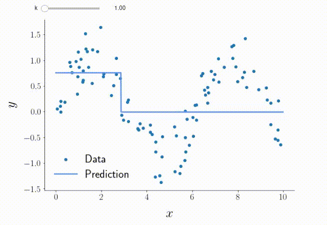
from ipywidgets import interactWe here want to use a slider to change the complexity of the regression tree we fit, as expressed by its maximum depth. To do so, we need three things. First, a function that takes the desired tree depth as a parameter \(k\) and learns the tree and generates a plot of the results:
def plottingfunction(k: int) -> None:
    # Fit the model
    regr = DecisionTreeRegressor(max_depth=k)
    regr.fit(X, y)

    # Generating the plot
    fig, ax = pt.singleplot()

    # Print raw data
    pt.oligoscatter(ax, X, y, c="C0", label="Data")

    # Print prediction
    X_pred = np.arange(0.0, 10, 0.01)[:, np.newaxis]
    y_pred = regr.predict(X_pred)
    pt.majorline(ax, X_pred, y_pred, color="cornflowerblue", label="Prediction")

    # Beautify plot a bit
    pt.labels(ax, "$x$", "$y$")
    pt.legend(ax)
    pt.ticklabelsize(ax)
    pt.despine(ax)
Second, we generate the slider that changes the tree depth:
k_slider = widgets.FloatSlider(value=1, min=1, max=15, step=1)Third, we use interact to make a call to the plotting function, whenever the slider value has been changed:
interact(plottingfunction, k = k_slider);Done! This produces the following ouput in Jupyter Lab:
Overfitting
I have additionally made another function, in which the model is only learned based on a fraction of the dataset (the training dataset), and the predictive accuracy for both the training and the withheld, so-called testing dataset is calculated. (For more details, e.g. read this article.) In this way, we can check how well the model is able to deal with data it hasn't previously seen, i.e. new data it is supposed to operate on in the future. We get the following results:
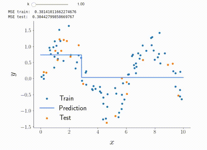
Playing around with the slider, we easily see that predictive accuracy for the testing dataset will start to get worse after the model has reached a certain degree of complexity. This is due to overfitting, i.e. "the production of an analysis that corresponds too closely or exactly to a particular set of data, and may therefore fail to fit to additional data or predict future observations reliably."
To really drive home this point, I have generated a third plot that shows the predictive accuracy (as assessed by the mean squared prediction error) for both parts of the dataset for different values of \(k\):
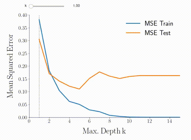
Based on the predictive accuracy for the testing dataset (orange curve), the optimal choice of tree depth seems to be \(k=5\). If we go back to the previous two plots, we can indeed see that this choice leads to the model catching most of the signal while not being affected by the randomly added noise too much.
Starting Voilà
Voilà can be started either out of Jupyter Lab by clicking the respective icon, or via the command line by running voila notebookname.ipynb. You'll see the following:
You may also want to use Voilà gridstack instead if you want to have a different layout than the standard one, which admittedly doesn't make good use of the available space. To this end, run voila Untitled.ipynb --template=gridstack. For this to produce anything visible, however, you first have to use the voila gridstack editor in Jupyter Lab to manually define the desired layout.
Conclusions
Voilà is extremely easy to set up, simple to use, and potentially very useful for presenting results to or sharing results with non tech-y people. I can definitely recommend checking it out :).