The anatomy of scRNA-seq datasets
Posted: 26th November 2021Preface
I was recently asked to give an internal introductory presentation to some of my colleagues about how to analyse scRNA-seq datasets. Because the talk was very well-received and considered useful, I decided to write it up and publish it here for future reference.
Generally, I talked about the structure and statistical properties of such datasets, and how those properties influence the way we work with these datasets. A special focus was laid on explaining the rationale behind the steps of a typical scRNA-seq preprocessing pipeline.
Introduction
What is scRNA-seq?
Single-cell RNA-sequencing refers to a set of methods used to measure the expression of genes in single biological cells. This is different from older methods such as microarrays and bulk RNA-seq, in which gene expression was only measured on the level of a complete population of cells. In this way, scRNA-seq is able to elucidate transcriptomic differences between individual cells of a sample. This is useful, because usually a tissue will show a significant degree of transcriptomic variability between its individual cells. (This is usually referred to as "intercellular heterogeneity.") Thus, these methods can greatly enhance our biological understanding of what exactly is happening e.g. in a healthy tissue sample or in a sample taken from a growing tumour.
The general sequencing workflow
To understand the rationale behind some of the preprocessing steps, a certain degree of understanding of the typical workflow of a scRNA-seq experiment is helpful. The following diagram (taken from here and slightly modified) depicts such a typical workflow.
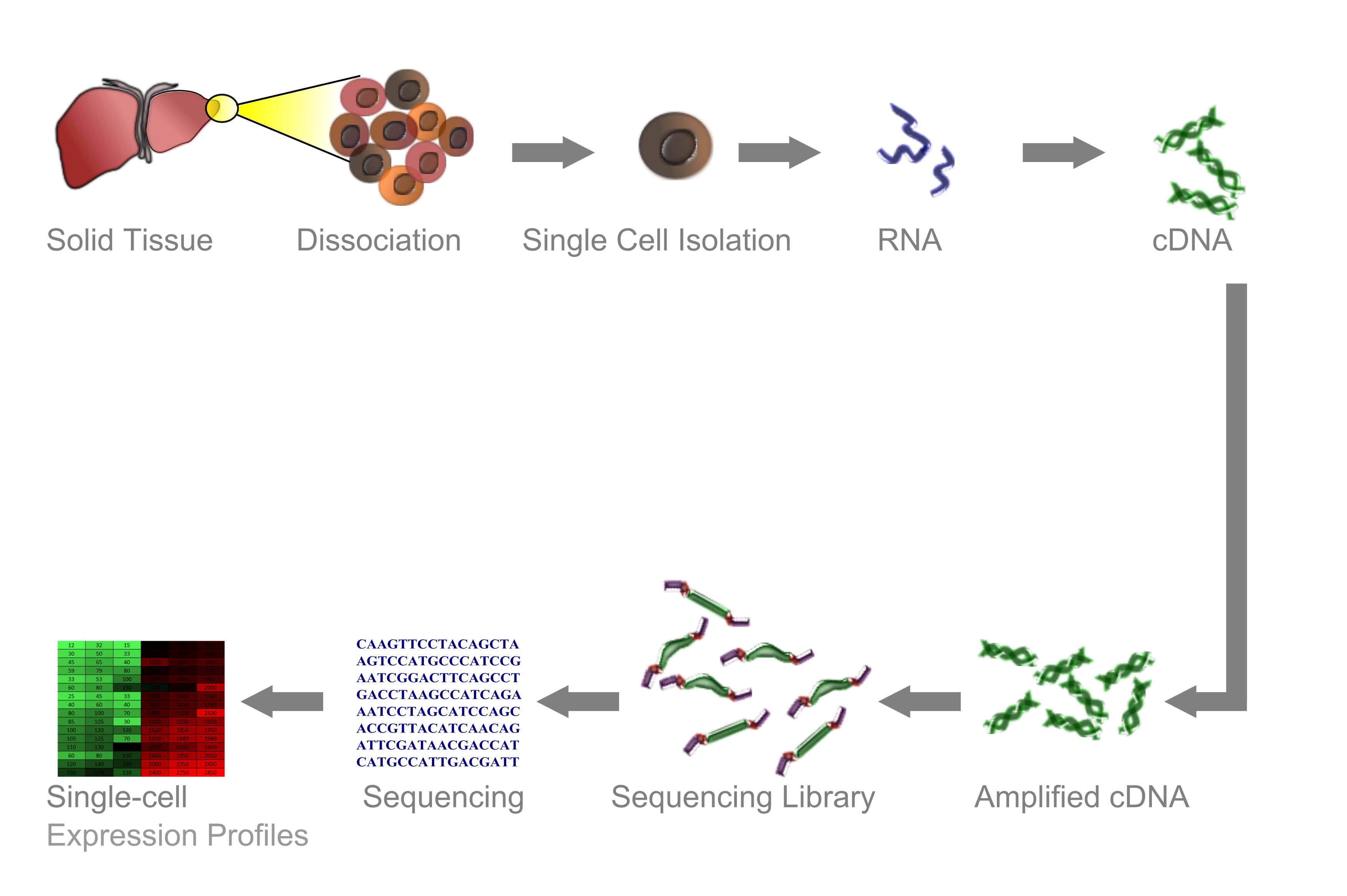
A sample is taken and dissociated into its single cells. These single cells are then enclosed in so-called "droplets" and tagged with a unique molecular barcode. The single-stranded RNA molecules of the individual cells are then converted to double-stranded DNA, which can then be amplified and sequenced. Finally, the obtained sequences are assigned to the genes they have been transcribed from. In this way, we obtain a matrix which contains the counts of all gene transcripts for every gene in every cell.
The remainder of this post will deal with the statistical analysis of such a count matrix. We will roughly follow the preprocessing pipeline and some of the analyses described in this excellent jupyter notebook from the Theis lab. Also check out the paper Current best practices in single-cell RNA-seq analysis: a tutorial by Luecken and Theis to which the notebook belongs.
Preprocessing
Filtering cells and genes
It is important to note that usually the count matrix requires some preprocessing before any actual analysis can be performed. This is crucial to ensure accurate and reliable results. In particular, we need to filter out both cells and genes.
Regarding cells, we need to take care of the following things:
- Stressed and dying cells: Cells that have been exposed to a high amount of stress, e.g. physical stress during tissue dissociation, can undergo apoptosis. Such cells do not show all too many nuclear gene transcripts any more, as those degrade rather quickly. But because mitochondrial transcripts, in constrast, tend to be more long-lived, overall these cells will show up as cells with a high percentage of reads from mitochondrial genes. Usually, we want to exclude these cells due to their small information content.
- Empty droplets: Droplets, in which no cell has been enclosed. They show up as 'cells' in the count matrix in which only a small number of transcripts is found (usually on the order of 1'000 counts). Don't get fooled, though – these genes are not really expressed, but have just been detected from the background 'soup' of ambient RNA.
- Doublets: Droplets, in which two cells have been enclosed. These can be identified by looking for 'cells' with unusually high numbers of transcripts (usually on the order of 50'000 counts).
For filtering cells, we thus usually want to produce two histogram or density plots. First, we want to plot the distribution of the percentage of mitochondrial reads. This might look like the following, where we have marked in orange the cut point, above which we will discard cells:

We also want to plot the distribution of the number of counts per cell. Such a plot (with the region to retain marked by the vertical orange lines) might look as follows:

Regarding genes, we have to mainly get rid of uninformative genes. Given that in a tissue usually only a subset of the ~50'000 measured genes is expressed in the first place, and given that per expressed gene on average only a handful of RNA copies are present in the cell, and finally given that the measuring process does never capture all copies, it does not come at a surprise that most entries of the count matrix are in fact zero. Many genes can hence only be found in a small number of cells or nowhere at all. Hence, they are likely to not contain any relevant information. We thus need to filter out all genes which do not occur in at least a certain number of cells of our sample. Usually, I select a cutpoint of 30 cells, because everything below is unlikely to be useful for statistical analyses.
Normalising the count matrix
Our filtered count matrix now contains the counts of transcripts of the measured genes detected in the individual cells of our sample. However, these numbers are influenced by the number of overall reads detected in a cell. As we already have seen before, these numbers vary between cells, which can e.g. be a connsequence of differences in cell sizes and different capturing efficiencies between individual cells during measurement. Thus, in order to interpret the count matrix, we need to take into account the variability in the sum of counts between different cells.
To this end, we do what is usually referred to as "normalisation." The simplest approach is a normalisation by the total counts in a cell over all genes, so that every cell has the same total count after normalisation (usually a target of 10'000 counts is selected, but since we just perform a linear scaling, this should not alter the results of downstream analysis). Multiple other methods with higher degrees of sophistication are also available. These methods e.g. try to estimate the true physical size of a cell based on the expression of certain genes. We will not cover these methods here – please refer to the paper and the jupyter notebook linked above for more information.
Log-ing the count matrix
Finally, we usually want to log-transform our count matrix element-wise. The intuition behind this is that the count data is assumed to come "closer" to a normal distribution by log-transforming it (which can be expected to increase the reliability of downstream analyses), however this assumption is usually not explicitly tested. Generally, there also seems to be some debate around the question whether count data should be log-transformed or a different transformation (if any) should be applied.
Some general pointers for downstream analyses
The exact choice of which downstream analyses to carry out on the preprocessed count matrix depends on the study system and the questions we want to answer. For this reason, we can here only give some general pointers and explain some general principles.
Finding highly variable genes
Now that we have filtered and log-transformed the count matrix, let us inspect the behaviour of its remaining genes. In the following plot, we show the mean and the standard deviation of the log-counts of approximately 11'000 remaining genes of an exemplary dataset:

Because the standard deviation is correlated with the mean, we compute the coefficient of variation by dividing the latter by the former. We get the following distribution:

There seems to be a very high number of genes which do not show all too much variation between cells. These might, for instance, be housekeeping genes which are constitutively activated, and generally we can expect them to not carry all too much biological information.
Thus, it can generally be very advisable to identify those genes which show the most variability between cells, as these can be expected to be the "interesting" ones. Usually, one wants to identify the top-500 to top-2000 variable genes, but other thresholds are possible depending on the nature of the dataset. Conversely, those genes that show close to no variability between cells can be excluded from further analysis. In this way, we reduce noise by excluding noninformative features from our dataset, and thus increase the signal content of emebddings (see next section), as well as the statistical power of some of our downstream analyses.
Computing lower-dimensional embeddings
Even when only considering highly-variable genes, a scRNA-seq dataset still has around the order of ~1'000 dimensions. Obviously, directly visualising such a dataset in a way accessible to the human brain is challenging; hence, exploratory analyses can profit from lower-dimensional embeddings of the dataset which try to capture its main structure in a reduced space (of usually two dimensions). It is very important to note, however, that these embeddings should only be used as a visualisation aid for exploratory analysis. They cannot be used to prove or disprove hypotheses rigorously, because "while they display some correlation with the underlying high-dimension data, they don't preserve local or global structure & are misleading. They're also arbitrary." Hence, all insights gained from the inspection of such an embedding need to be carefully tested ndependently of that embedding.
Some typical lower-dimensional embeddings used for scRNA-seq datasets include Principal Component Analysis (PCA), Uniform Manifold Approximation (UMAP), and Diffusion Map. Benchmarking their performance in different scenarios is a topic of current research.
Clustering for identifying groups of similar cells
Clustering scRNA-seq data is widely used throughout the literature, however some words of caution need to be given:
- First, it is often implicitly assumed without validation that clusters correspond to biological cell types and vice versa, although there is no reason that this always has to be the case.
- Second, the results of clustering can be extremely sensitive to the choice of distance function and the choice of the clustering algorithm and its parameters.
- Finally, a clustering algorithm will always identify clusters, even in a dataset which completely consists of noise. Thus, clusters identified in a dataset need to be carefully checked for plausibility. The following simulation illustrated this problem.
We sample 200 points from a two-dimensional normal distribution with means zero, and identity variance-covariance matrix. This distribution is easy to plot. By construction, it does not contain any clusters, and it looks as follows:

We now apply a k-means clustering with k=3, obtaining the following "clusters":

Altogether, it is advisable to carefully check metrics of clustering performance to determine the true information content of a clustering, as well as check the robustness of a clustering to changes in distance metric and clustering algorithm. One should also always keep in mind that a cluster of cells does only imply a cluster of transcriptomically similar cells, which does not have to constitute a biological cell type.
Once a clustering has been computed and checked, we can use it for, among others, the following things:
- By checking the expression of marker genes indicative of certain cell types, we can make educated guesses whether certain clusters correspond to certain biological cell types. Clusters which cannot be identified might (!) correspond to as of yet undiscovered cell types.
- We can also identify new marker genes of a given cell type by analysing which genes are differentially expressed among cell types.
- If we have performed an experiment where we compare different experimental conditions (such as cells taken from different positions in a tissue, or cells treated with different pharmaceutical agents, or cells taken from healthy vs. diseased tissue), we can compute changes in cell type composition between different experimental conditions. (Of course, we also can check independently of any clustering which genes are overall up- or downregulated between different experimental conditions.)
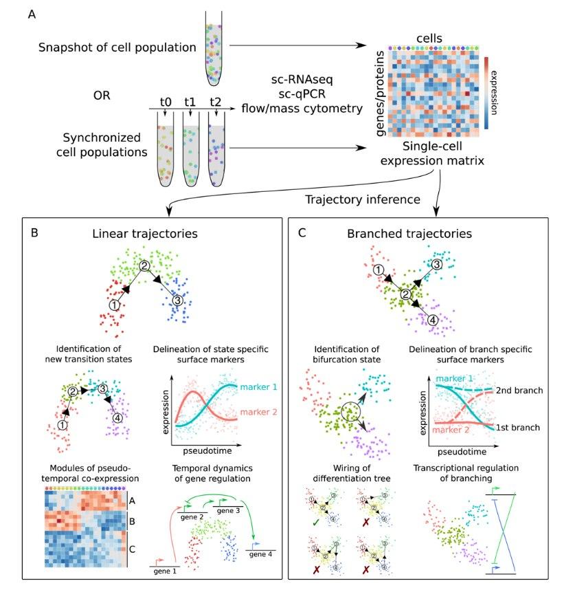
Trajectory inference
As pointed out earlier, a clustering algorithm will always be able to identify "clusters" of data points in a dataset, even if no clusters are present in the first place. This can, for instance, be the case in developing fetal or embryonic tissue, as well as tissues in which cells continuously undergo a differentiation process such as the intestinal epithelium. In such cases, instead of clustering it is more advisable to instead try to find a continuos trajectory along which cells can be ordered.
Multiple methods are available for this (for a review refer to this paper by Cannoodt and colleagues), which differ in e.g. their algorithmic approach or the shape of trajectories that can be inferred. A main distinction here lies in whether a single-path, or a branched (or "bifrucating") trajectory is inferred.
Once a cellular trajectory has been reconstructed, different analyses can be run, some of which are similar to the analyses which can be carried out on clustered data (see section before).
- By checking the expression of marker genes along the trajectory, we can make educated guesses which parts of the trajectory correspond to which biological cell types or states.
- In this way, it is also possible to identify new genes that change over the course of the trajectory and are thus specific for certain cell states and to identify new transition states.
- Related to this, we can also identify modules of genes which are co-expressed over the course of this trajectory.
- Specific to branched trajectories, it is possible to identify and characterise cellular bifurcation states, and to delineate branch-specific marker genes.
- Finally, we can again analyse how the "composition" of the sample (with respect to the cells' position on the trajectory) changes between different experimental conditions.
The following diagram, taken from Figure 1 of the previously mentioned paper by Cannoodt and colleagues, summarises the previous section nicely:
Conclusion
- Single-cell RNA-sequencing has established itself as a powerful tool for gaining biological insights at single-cell resolution. Its use, however, can benefit from a basic understanding of the experimental workflow employed to obtain the dataset.
- The importance of the preprocessing steps in the analysis pipeline cannot be overstated, as the reliability of all subsequent downstream analyses directly hinges on them.
- As with all computational analyses, obtained results should always be viewed critically and tested for their robustness and sensitivity to analytic choices.